Introduction
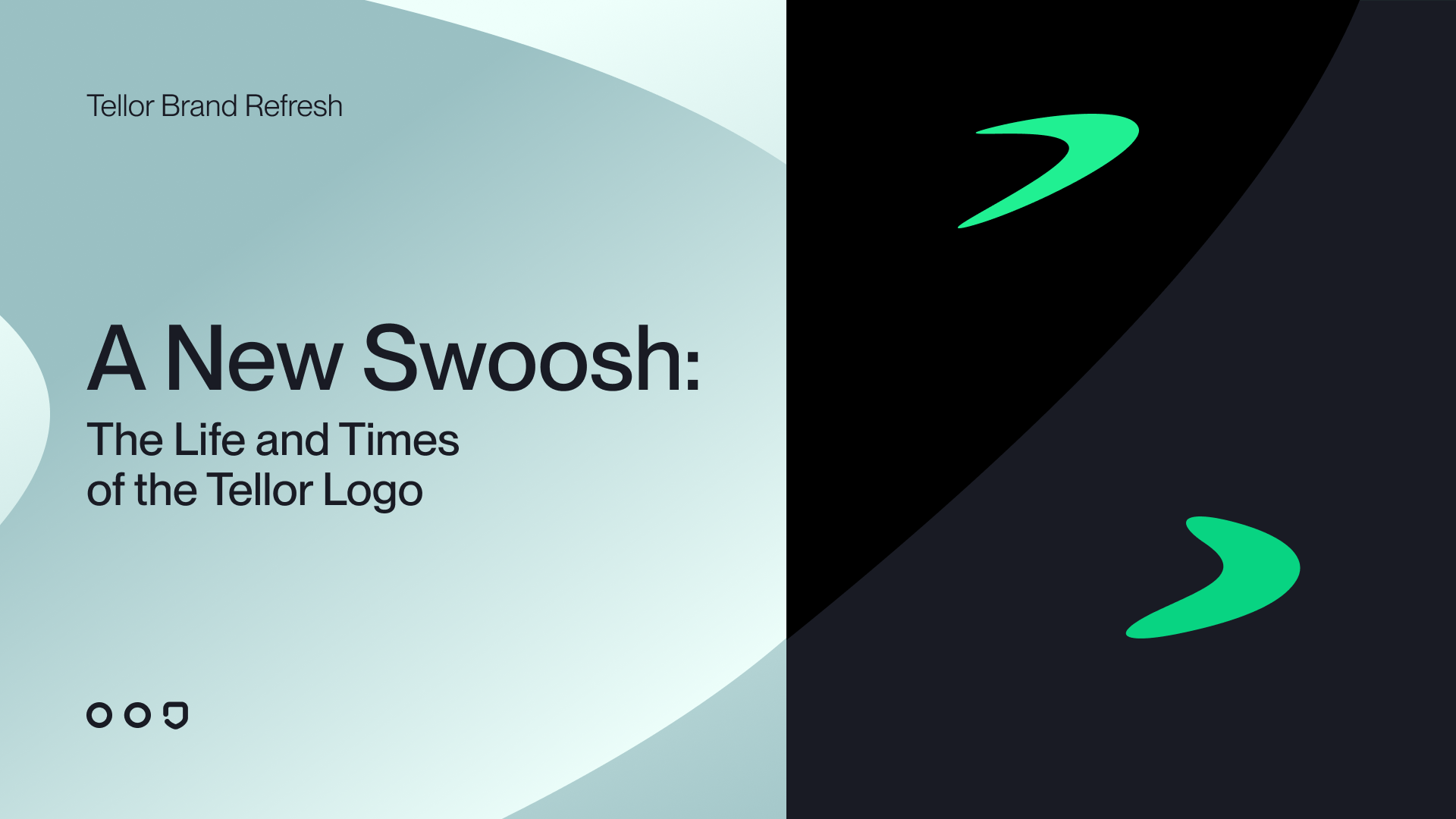
Today, we’re thrilled to unveil a refreshed look for the Tellor logo and brand. At Tellor, our focus has always been on building the best technology—our protocol is the heart of everything we do. But as crypto evolves, so do the ways we communicate who we are and what we stand for. We believe that crypto is inherently a values-driven technology, and our brand should reflect that. Our logo and colors have become more than just a design—they embody the tech, the team, and the history that make Tellor unique. So while we’re excited about this new chapter, we’re also feeling a bit nostalgic. Let’s take a look back at the story of Tellor’s brand and how we got here.
Tellor Brand Beginnings
In early 2019, Tellor’s story began. Nick, Brenda, and I (Mike) had just applied to Binance Labs with an idea for an oracle project. To our surprise, we were accepted into their multi-week incubator program in Berlin—a place buzzing with some of the most innovative projects in the space.
We had to come up with a name and logo fast. After brainstorming, we landed on “Tellor,” a combination of “telling” and “oracle.” The name felt right—an oracle tells blockchains what’s happening in the real world. As for the logo, we wanted something clean and strong in lowercase letters. The Renogare font fit the bill, and a quick swipe of the marker on a dry-erase board gave us our first “arrow.” It wasn’t fancy, but it worked.
At the time, Chainlink dominated the oracle space and had already claimed blue as its signature color. So, we chose green. It felt fresh, different, and full of energy—perfect for what we were building.
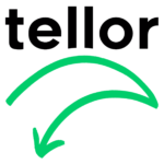
The arrow in the logo was meant to represent fetching data and bringing it back, just like an oracle does. In hindsight, it looked a little too similar to Amazon’s logo—though I swear it was unintentional!
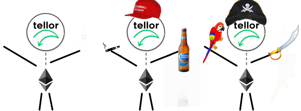
During the Binance Labs program, we received a lot of feedback on our logo. One comment stuck with me: “The arrow points down. This is crypto—you want it to go up!” And just like that, our original logo was retired. But it wasn’t gone forever. It found a new life as the face of Tellorman, our first mascot who made regular appearances during our “tech calls” (later renamed dev calls).
The Birth of the Swoosh
Inspired by the original arrow concept, I started experimenting with shapes that could better capture the idea of fetching data. A boomerang came to mind—something that goes out and returns, much
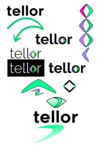
like an oracle’s function. At first, I explored placing two boomerangs together to form a diamond, which felt strong and clean. But we didn’t want to lean too heavily into “diamond hands” memes or trader culture, so that idea was scrapped.
Eventually, I landed on an elliptical swoosh—a sleek, continuous motion that still retained the essence of a boomerang. The elliptical shape represented the flow of
data, coming and going in a seamless loop. It felt bold yet simple, perfectly capturing Tellor’s purpose. Combined with the Renogare font, the swoosh became our new logo. Over time, we made small tweaks, but the swoosh stayed true to its roots as a symbol of continuity and the core functionality of Tellor.
Introducing the New Swoosh

Today, as we prepare to launch Tellor Layer—our new oracle protocol built as its own blockchain—it feels like the right time to refresh our brand. After five years as one of the longest-running oracles in the space, we wanted a logo that reflected our growth and maturity. We didn’t need a full rebrand—Tellor’s swoosh has earned recognition—but it was time for an update. This time, though, I wasn’t the one tinkering with the swoosh. We handed over our beloved brand to the talented team at 3MBRK. Huge shoutout to them for taking our dear swoosh and brand into their hands and giving it a thoughtful, polished makeover.
The new swoosh is a bit slower and more grounded than its predecessor. It’s stronger, sturdier—maybe even a little chubby. It feels more mature yet somehow younger, a balance that reflects the experience we’ve gained while staying agile and forward-thinking. And that’s intentional. Tellor has never been about being the fastest oracle. We’ve always prioritized security and decentralization above speed, and our new swoosh reflects those values. It’s a symbol of who we are now: reliable, secure, and built to last. Plus, let’s be honest—it’s just cuter.
A Fresh Color Palette

To complement our updated logo, we’ve introduced a new color palette that reflects Tellor’s mission and values.
- Inkwell provides a foundation of strength and stability, reinforcing Tellor as a trusted oracle solution.
- Opal brings clarity and innovation, highlighting our transparent and forward-thinking approach.
- Neptune bridges trust and growth, symbolizing reliability in an ever-evolving ecosystem.
- Pine adds grounded resilience, representing the dependable infrastructure we’ve worked hard to build.
- Emerald injects vibrant energy, embodying the dynamic and growing Tellor community.
Together, these colors create a cohesive identity that positions Tellor as a leader in decentralized oracles.
Looking Ahead
This refresh isn’t just about a logo or new colors. It’s about stepping into the next phase of Tellor’s journey with intention and clarity. Our updated brand reflects everything we’ve built over the last five years—and everything we plan to achieve in the years to come.
Thank you to everyone who has supported us along the way. This is your story as much as it is ours, and we’re honored to have you on this journey with us.
Here’s to the future of Tellor—and the next chapter of our decentralized oracle.
-Mike Zemrose,
Cofounder and CSO


